Stats for the New Year
When December rolls around it is a good idea to take a step back from short-term charts and focus on long-term patterns to prepare for the coming year. Creating a spreadsheet of statistics is a great start. Traders need to know when a market is ripe to trend or ready to consolidate. Tracking vertical measurements of price action in various time frames can be a useful resource when timing directional trades or determining when the end of a trend is near.
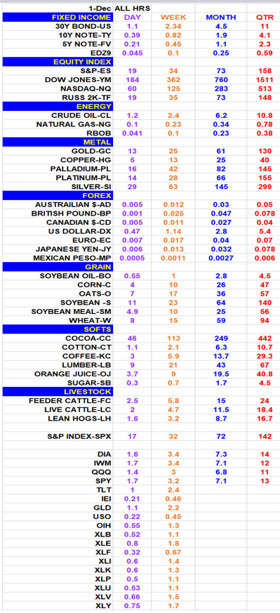
It is imperative to identify benchmark ranges to recognize if a market has moved too far or too fast, or if it has consolidated enough to favor a breakout or onset of a trend. Most charting software has an indicator called ATR or Average True Range. To stay current with volatility you do not want track ranges from years ago as they may not be relevant to current price movement. Not long ago the S&P was averaging more than 35 points a day. This year the average day range spanned about 12 points at its lowest, and now it averages almost 20 points per day. When projecting profit it is vital to know how far a market is likely to travel given the current volatility and time frame. It is all about probability. For example, if a day range equals the length of an average week, odds favor a period consolidation. On the other hand, if a range over a week spans just the length of an average day, odds favor a breakout.
The spreadsheet below should be a good cheat sheet as we enter the New Year. The statistics show ranges over various time frames. The ‘Day’ column displays the average range over the past 20 days (roughly 1 month of trading). The ‘Week’ column tracks the previous 9 weeks. Seven months and 5 quarters are shown in the other columns. Keep this stat sheet handy when projecting how far a market is apt to travel.
Next time we will review the dimension of time at price or the horizontal measurements.
John Seguin, Market Taker Mentoring
