Identifying Trends and Turns Using ATR
Investors or longer-term traders endeavor to pick off extreme highs or lows. As a matter of fact, all traders dream of picking off major highs and lows. In this week’s article I want to focus on a couple of long-term indicators. It is widely accepted that the investor benchmark moving averages are 50- and 200-day. When viewing weekly charts, I use a 13- week moving average (MA), which covers 1 quarter of the year. And for longer-term looks, I prefer a 52-week MA to cover a full year. These MAs are akin to 50- and 200-day moving averages. I use these in conjunction with a 13-period average true range (ATR).
As seen again last week, when the stock market takes a downturn the ranges tend to be much larger than average as panic sets in. During rallies ranges tend be near average or lower. Stock indexes tend to rise like freight trains, slow and steady. They often go down rapidly like commuter trains. This phenomenon is portrayed in the weekly SPY graph below.
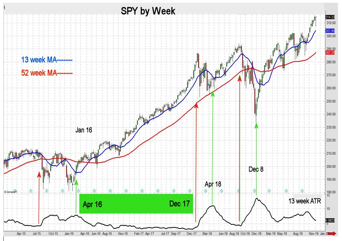
The trend higher from April 2016 through December 2017 was slow and steady with the ATR remaining on the low side. When the ATR begins to turn higher the stock market tends to sell off in dramatic fashion. The red arrows illustrate this. On the other hand, when the market bottoms, it tends to do so when the ATR turns down from the peak (green arrows).
I pay close attention to short-term ATRs to enhance the timing of trend reversals for mid- and short-term trading strategies as well. When viewing daily bar charts, I prefer a 5- and 20-day MA with a 14-period ATR.
To summarize, check volume figures frequently. When volume rises to unusual levels, so do ranges. This may be a hint to hedge long positions with covered calls or long puts, for example. Directional strategies work best when volume and range size are near average.
John Seguin, Market Taker Mentoring
