History Helps Determine Support and Resistance
All traders strive to buy when prices are cheap and sell when they are rich. Bulls/buyers play the long side and search for support areas; bears/shorts favor the sell side and seek resistance areas. The choice to be a bull or bear varies for all traders. To determine support and resistance zones history helps. An ideal trade occurs when we catch a trend early and exit when it is exhausted. Traders endeavor to sell at a premium and buy when prices are cheap. Perfect entry and exit are desired, however rarely reality.
Price Patterns
Finding ideal trade location is one of the most difficult tasks for traders. To hone your ability to pick off extreme highs and lows of a trend, refer to recent history. Chart patterns repeat in all markets and time frames. Markets tend to stall and reverse after retesting previous high-volume areas. In graphs, high-volume zones frequently take the shape of triangles (pennants) and rectangles (flags). They are also known as congestion or consolidation zones. Therefore, we must identify a high-volume area. Reversals in direction frequently occur when retesting previous acceleration points as well, so we must identify those too.
High-Volume Zone Patterns
High-volume zones take shape before and after extraordinary vertical moves or trends. Implied volatility tends to decline while these consolidation patterns take shape. When a market retests the top of a previous flag formation, it often provides a support area. When price rises enough to retest the bottom of a flag or rectangle shape, it typically provides a resistance area. The pennant formation is triangular and usually has an apex. Apexes reveal high volume or fair prices that are usually solid support/resistance when retested. Train your eye to identify these shapes. Your trade location will improve and subsequently so will profits if you use these patterns for entering and exiting positions.
Acceleration Points and Gaps
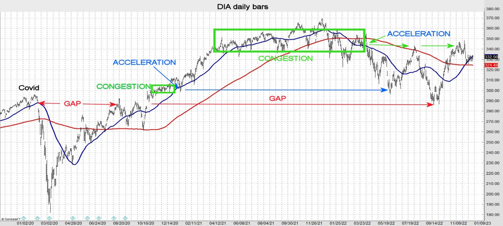
An extreme (top or bottom) is often made when a market tests a previous acceleration point or a gap. When a market breaks out of a congestion phase, the move is often violent with an increase in volume. Breakout candlesticks typically have a long body with short to no wicks. The chart below illustrates the acceleration of a trend after a consolidation phase and when a gap is tested. When a pre-pandemic flag was revisited, a reversal occurred, leading to months of choppy trendless trade. Also, note the congestion pattern in the middle of the graph. The breakout began at the apex of the triangle with a long-bodied green candle. Many trends begin this way.
Double Tops and Bottoms
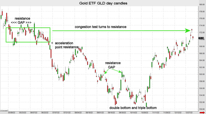
Support areas often form when a previous extreme low is tested. This is called a double bottom pattern. Conversely, a double top occurs when an old extreme high is retested. When a double bottom or top is tested it sometimes turns into a triple bottom or top (see GLD chart below).
History Helps
When searching for optimal entry and exit levels, history can be a great help. Tracking old highs and lows as well congestion patterns (flags and pennants) is a good start. A little charting homework will improve trade location thus increasing profit potential while reducing risk.
John Seguin, Market Taker Mentoring
